Transforming dimly lit areas into vibrant havens is achievable with the right wall colours for dark spaces. Choosing light-reflecting colours not only enhances the visual appeal but also creates a more inviting atmosphere. Optimal colour choices can brighten dark rooms effectively, making them feel more spacious and alive. As we explore the nuances of colour in interior design, consider how these selections influence not just brightness but also the overall mood of your living environment. For insights into the best colours for your modern living space, visit this resource.
The Importance of Colour in Interior Design
The significance of colour in interior design cannot be overstated. It serves as a powerful tool that shapes not only the look of a space but also the feelings it evokes. Effective interior design choices consider the colour palette’s psychological implications, drawing from colour theory to create an atmosphere that aligns with the intended purpose of the area.
Colours can influence emotions and behaviours in remarkable ways. For instance, lighter hues tend to create an illusion of spaciousness, making a room feel open and airy. In contrast, deeper shades can offer a sense of intimacy, ideal for creating cosy environments.
Understanding the role of colour can enhance any design project, ensuring that colour schemes are chosen with both aesthetics and functionality in mind. Careful selection can transform any space, infusing it with personality and warmth, making the home an inviting sanctuary.
What wall colors brighten up darker spaces?
Choosing the right wall colours plays a crucial role in brightening darker spaces. Understanding the principles of light reflection can significantly enhance the room’s atmosphere and overall feel. When selecting colours, keep in mind how these choices will impact not just visibility, but also the emotions evoked by the environment.
Understanding Light Reflection
Light reflection is a vital factor when considering how to illuminate a room. Glossy finishes excel at reflecting light, more so than matte options. This quality makes them an excellent choice for spaces with limited natural light. Implementing shiny surfaces in your decor can create a luminous effect, thereby enhancing brightness and making even the smallest areas feel more expansive.
Impact of Colour on Mood
The colour impact on mood is profound. Different hues can influence feelings of happiness, calmness, or energy. For instance, soft greys and whites promote a tranquil atmosphere while bright shades can invigorate the spirit. Selecting the right colour palette is essential for achieving a harmonious balance in the ambience, especially when aiming for spaces that are primarily dark.
Soft Whites and Creams
In the realm of interior design, soft whites and cream colours reign supreme when it comes to enhancing darker spaces. These gentle hues not only reflect light effectively but also create a sense of openness and serenity in any room. By choosing the right types of white paint, homeowners can achieve warm, inviting environments that elevate their living spaces.
Varieties of White Paint
There is an array of types of white paint available, each possessing distinct qualities that cater to different aesthetics. Some popular options include:
- Eggshell: Offers a subtle sheen, providing elegance and durability.
- Satin: Strikes a balance between matte and gloss, perfect for drawing in soft light.
- Glossy: Reflects light brilliantly, making it ideal for small, shadowy rooms.
These variations of soft whites can transform walls, making spaces feel brighter and more spacious.
Why Creams Work in Low-Light Areas
Cream colours are particularly effective in low-light areas due to their ability to introduce warmth without overpowering a space. They create a cosy yet airy feel, allowing rooms to exude comfort. Using creams effectively can enhance the natural light available, making areas that might otherwise appear gloomy feel inviting. Their versatility goes hand in hand with various decor styles, reinforcing their position as a top choice for creating uplifting interiors.
Pastel Shades for a Cheerful Ambiance
Incorporating pastel shades into your home offers a fantastic way to create a cheerful ambience, particularly in darker areas. These soft hues can lift spirits and make spaces feel more inviting. A palette of pastel colours not only enhances the brightness but also infuses an element of tranquillity and warmth.
Popular Pastel Options
Some popular choices when considering pastel paint ideas include:
- Pale pinks that evoke softness and romance.
- Soft blues promoting calmness and serenity.
- Lilacs that add a hint of sophistication.
Each of these colours carries unique qualities that can transform a dull space into a vibrant retreat, making them ideal for rooms lacking natural light.
Combining Pastels with Decor
Integrating pastel colours with furnishings can create a harmonious relationship between walls and decor. For a cohesive look, consider pairing pastel walls with neutral elements, such as beige or white furniture. This balance ensures the space doesn’t feel overwhelming while preserving the lively spirit that pastels evoke. Mix and match pastel shades in accessories like cushions and artwork, bringing an extra dimension to your interior.
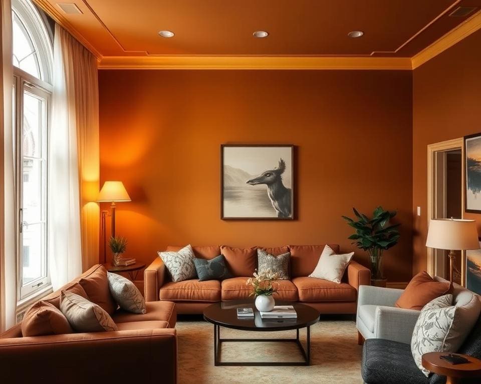
Bright and Bold Colours
Incorporating bold colours into your interior design can transform darker spaces into vibrant and energising areas. Choosing the right bold hues is essential for creating an uplifting atmosphere without overwhelming your decor. Bright hues like vivid yellows and deep blues can play a significant role in enhancing the light within a room, all while adding character and style.
Choosing the Right Bold Hues
When selecting bold hues, consider a palette that complements existing furnishings and personal taste. Some popular options include:
- Vibrant yellows that infuse warmth and cheerfulness
- Electric blues for a modern touch
- Rich reds to add drama and excitement
- Jewel tones such as emerald green or amethyst for a sophisticated feel
Matching these bold colours with neutral elements can create a balanced look, allowing the bright hues to shine without overwhelming the space.
How to Use Bright Colours Wisely
Applying bold colours effectively requires thoughtful consideration. Here are some colour application tips:
- Use bright colours in accents, like cushions, artworks, or decorative items, for a pop of vibrancy.
- Consider a feature wall in a bold colour to serve as a focal point within the room.
- Pair bold colours with softer shades to create contrast while maintaining harmony.
- Incorporate natural light sources to enhance the vibrancy of bold colours throughout the day.
Neutral Tones for a Timeless Look
Incorporating neutral tones into interior design offers a classic appeal that endures over time. These colours create a calm and balanced environment, perfect for spaces that require additional warmth and light. With the right selection, neutral hues can dramatically enhance the perception of light in darker areas, making them feel more inviting and spacious.
The Effect of Neutrals on Light
Neutral tones, such as taupe, beige, and soft grey, possess the remarkable ability to reflect light. By absorbing less of it compared to darker shades, these light-enhancing neutrals can transform a dimly lit room into a brighter haven. The soft characteristics of these colours contribute to a soothing backdrop, allowing other accent colours and decor elements to shine without overwhelming the senses.
Best Neutral Shades for Dark Spaces
Choosing the right neutral shades is essential for maximising light in darker areas. Some of the best options include:
- Soft White – A versatile choice that brightens any room while offering a clean canvas for decor.
- Warm Beige – Infuses a sense of comfort and warmth, making spaces feel inviting.
- Light Grey – Adds sophistication without sacrificing brightness, perfect for a modern aesthetic.
- Greige – A combination of grey and beige that brings warmth while remaining stylishly neutral.
These shades work harmoniously with vibrant accents, enriching the overall aesthetic and complementing timeless decor. Selecting the right combination of neutral tones will elevate your space, allowing light to flourish and create an atmosphere that is both serene and sophisticated.
Accent Walls for Depth and Light
Accent walls offer a fantastic opportunity to transform a room, adding not just vibrancy but significant depth. By selecting the right colour, you can create a focal point that enhances the overall ambience, breathing life into spaces that might feel flat or uninspired. Whether you opt for bold, energetic hues or softer, more playful shades, accent walls can effectively serve as a canvas for your creativity.
How to Create an Accent Wall
To create an accent wall, begin by choosing a wall that naturally draws attention, such as one behind a sofa or bed. Consider the following steps:
- Pick a wall that will create an inviting focal point.
- Explore paint options that complement your existing decor.
- Apply a fresh coat of a contrasting colour that can energise the space.
- Consider incorporating texture or patterns for added interest.
Choosing the Right Colour for an Accent
Selecting the appropriate colour for your accent wall is crucial. Here are some accent colour ideas that can brighten your space:
- Use warm tones like coral or soft yellow to evoke warmth.
- Opt for cool shades such as teal or muted greens for a calming effect.
- Employ rich colours like deep navy or burgundy for sophistication.
- Incorporate lighter colours to enhance the perception of space.
By carefully considering these factors, you can create depth in your room and ensure it remains airy and inviting.
The Role of Lighting in Colour Perception
Lighting plays a crucial role in how colours are perceived within a space. Understanding the impact of different lighting effects allows homeowners to make informed decisions about their interior design choices. Both natural light benefits and artificial lighting solutions can significantly influence the mood and brightness of a room.
Natural vs Artificial Light
Natural light brings warmth and vibrancy, enhancing the overall aesthetic of any colour palette. During the day, sunlight can reflect off surfaces, showcasing the true hues of paints and textiles. On the other hand, artificial lighting can create a range of atmospheres depending on the type and placement of the fixtures. Different bulbs emit varying tones of light, such as warm, cool, or neutral, all of which can alter the appearance of colours on the walls.
Best Lighting Practices for Dark Rooms
Maximising brightness in dark rooms involves the strategic use of layered lighting. Combining ambient, task, and decorative lighting not only increases the overall illumination but also adds depth to the space. Consider the following practices:
- Utilise multiple sources of light to avoid shadows and dim areas.
- Incorporate fixtures that allow for adjustable brightness to cater to different activities.
- Choose light bulbs that mimic natural light for a more authentic feel.
By embracing both natural light benefits and effective artificial lighting solutions, a home can truly shine, accentuating the chosen wall colours while creating an inviting atmosphere.
Choosing the Right Finish for Your Walls
Selecting the appropriate paint finish is crucial for achieving the desired brightness and longevity in your interior spaces. Various paint finish types—such as matte, satin, eggshell, and gloss—offer distinct qualities that can dramatically influence how light interacts with your walls. For example, gloss finishes reflect more light than their matte counterparts, making them an ideal choice for darker rooms where brightness is key.
When considering wall finishes for brightness, think about how each finish will complement your chosen wall colours. A satin or eggshell finish can strike a balance, providing a soft sheen that reflects natural light while still maintaining a warm feel. In contrast, a high-gloss finish will emphasise vibrant hues, further enhancing the visual impact of your colour choices in low-light areas.
Utilising finish selection tips, it’s essential to factor in the room’s purpose. For high-traffic areas or places prone to moisture, a more durable finish will protect your walls and maintain their appearance over time. Conversely, in quieter spaces, a matte finish may suffice, imparting a chic, contemporary vibe. Ultimately, the right finish not only elevates the aesthetic appeal of your interiors but also optimises light reflection, ensuring your darker spaces feel more inviting and bright.