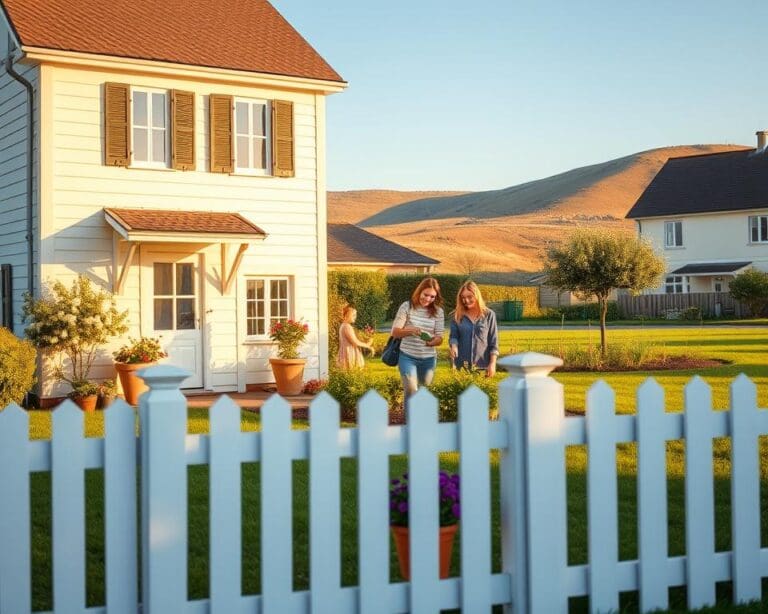
The significance of colour choice in home design cannot be overstated. It plays a vital role in shaping the atmosphere and aesthetics of any interior space. A well-thought-out colour selection enhances the overall appeal of a room, evokes emotions, and even improves functionality. Understanding the importance of colour is essential for creating an inviting and harmonious environment that resonates with the inhabitants. In the realm of UK home decor, the right colours offer the opportunity to craft spaces that reflect personal style while also considering current trends and practical implications.
The Impact of Colour on Mood and Well-being
Colour plays a pivotal role in shaping our mood and emotional well-being. The principles of colour psychology reveal that various hues can significantly influence how we feel and behave in different spaces. Understanding these colour effects enables homeowners to make informed choices during their room colour selection, resulting in environments that cater not only to aesthetics but also to emotional impact.
Understanding Colour Psychology
The study of colour psychology shows how different shades evoke distinct feelings; blue, for instance, is linked to tranquillity while yellow is associated with cheerfulness. Incorporating this knowledge fosters a deeper appreciation for the way colour can alter our perspectives. By embracing suitable colours, individuals can enhance the comfort and functionality of each room. When aiming for a serene atmosphere, softer tones may be more suitable than vibrant options, as they promote relaxation and calm.
Choosing Colours for Different Rooms
When selecting colours for specific spaces, consideration of the room’s purpose is essential. For example, bedrooms may benefit from muted, calming shades, while home offices could thrive under energising tones. A balanced approach ensures that the room resonates with its intended function, further elevating mood and well-being. To explore effective colour selections, consider exploring current trends. These trends often highlight how to harmoniously blend personal style with emotional needs.
Why is Colour Choice Important in Home Design?
The selection of colours plays a pivotal role in home interior design, influencing the overall feel of a space. A carefully curated colour palette not only enhances aesthetic appeal but also contributes to a sense of cohesion throughout your home. Embracing cohesive colour schemes fosters an inviting atmosphere while seamlessly connecting different rooms.
Creating Cohesive Spaces
A unified colour scheme allows for fluidity in home design. By selecting colours that complement each other, homeowners can create a sense of harmony across different areas. Each room can maintain its unique identity while still echoing the overall theme of the home. This type of colour harmony is essential in making transitions between spaces feel effortless. When choosing colours, consider tools like colour wheels to find harmonious pairings that elevate the aesthetic experience.
Enhancing Natural Light Through Colour
Colour choice profoundly affects how natural light interacts with interiors. Lighter tones can amplify natural light enhancement, making spaces appear more open and airy. This is highly beneficial in smaller or less illuminated rooms, where darker shades can make the environment feel confining. Instead, selecting soft pastels or neutral hues allows sunlight to bounce off walls, uplifting the mood and creating an inviting atmosphere. Integrating strategic colour selections with natural light can dramatically transform any home.
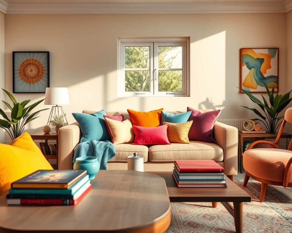
Incorporating Trends: Pastels, Neutrals, and Bold Tones
The world of home design is ever-evolving, with colour trends in the UK constantly shifting to reflect contemporary tastes and styles. The current focus highlights a beautiful balance of pastel colours, neutral shades, and bold colour applications. This trend not only brings vibrancy into spaces but also evokes emotion and creates an inviting atmosphere.
Current Colour Trends in the UK
Pastel colours have made a significant resurgence, celebrated for their calming effect and ability to create serene environments. These soft hues, ranging from gentle pinks to soothing blues, can turn any room into a tranquil retreat. In contrast, neutral shades offer timeless elegance, making spaces feel larger and brighter. They serve as the perfect backdrop for personal decor while harmonising with various styles.
How to Use Trendy Colours Effectively
Incorporating bold colour applications can transform a space dramatically, adding intrigue and depth. The key lies in their selective use; consider accent walls or statement furniture pieces that can draw the eye without overwhelming the overall aesthetic. When designing a room, blend pastel colours with neutral shades for a modern twist or introduce bold tones as highlighted features.
- Start with a neutral base to establish a balanced foundation.
- Introduce pastel accents through furnishings or wall art.
- Use bold colours sparingly to create focal points that attract attention.
Experiment with different combinations to discover what reflects personal style while embracing contemporary colour choices. This way, your home can be both stylish and uniquely yours.
Personal Style: Reflecting Your Personality
Transforming your living space into a reflection of your personal style can be an empowering journey. Colour plays a significant role in defining aesthetic preferences and can evoke emotions, set moods, and create atmospheres that resonate with who you are. Making customised design choices allows you to curate an environment filled with vibrancy and authenticity.
Defining Your Aesthetic through Colour
Your aesthetic preferences can guide the selection of colours that align with your identity and lifestyle. Consider the emotions certain hues evoke. For instance, calming blues and greens may reflect tranquility, while bold reds and oranges could signify energy and passion. By blending these colours, you can create unique colour palettes that truly embody your essence.
Tips for Personalising Colour Palettes
Crafting personalised colour palettes invites creativity and individuality into your home. Here are a few tips to inspire your journey:
- Explore different shades and tones by considering cultural influences that resonate with you.
- Draw inspiration from nature, utilising earthy greens and warm browns to create a grounded atmosphere.
- Incorporate artworks or textiles that speak to your personal style, allowing those elements to guide your colour choices.
- Experiment with complementary colours to enhance visual interest while maintaining harmony in your space.
Practical Considerations in Colour Selection
Selecting colours for your home extends beyond mere aesthetics; practical factors significantly influence the decision-making process. Homeowners should consider paint durability, especially in high-traffic areas where wear and tear can diminish the appearance of a space. Choosing paint that offers longevity of colours can save on the frequency of repainting, thus reducing overall maintenance costs.
Durability of Paint Colours
Investing in high-quality paints ensures greater paint durability. Options such as satin or eggshell finishes can stand up to scuffs and stains while maintaining their vibrancy over time. It is essential to evaluate the performance of specific colours, particularly in spaces like kitchens and hallways where durability is paramount.
Cost-Effective Colour Choices for Homeowners
Budget-friendly colour choices can transform any room without breaking the bank. Exploring local paint suppliers and leveraging paint recycling initiatives can provide significant savings. Consider hues that have timeless appeal, such as soft greys and warm beiges. These classic shades not only complement modern decor trends but also help maintain an inviting atmosphere. Incorporating cost-effective decor strategies will enhance your home’s appeal while staying within financial bounds.
The Role of Colour in Property Value
The choice of colour in a home is often more than just an aesthetic consideration; it plays a pivotal role in determining property value. Research consistently shows that neutral colour schemes tend to resonate with a broader audience, thus enhancing home marketability. For potential buyers, first impressions are crucial, and a well-selected colour palette can make an immediate impact, setting the tone for their entire experience of the property.
Moreover, colour influence extends to the emotional associations people make with different shades. Warm hues may evoke feelings of comfort and welcome, while cooler tones can impart a sense of tranquillity and space. These emotional connections can significantly affect design choices affecting value, steering homeowners towards selections that not only reflect personal style but also appeal to future buyers and investors.
When considering the long-term implications for property investment, it’s essential to strike a balance between personal preference and market trends. By making informed colour choices, homeowners can create spaces that are both beautiful and functional, ultimately ensuring their property maintains its value over time. Emphasising the importance of colour not only enriches the living experience but also supports the practical aspects of property ownership in a competitive market.