Modern interior color trends shape how homes feel and function. For readers seeking home color inspiration, understanding the interior color forecast helps with decisions that affect perceived space, resale value, and long-term comfort.
Authorities like the Pantone Color Institute and brands such as Sherwin-Williams and Benjamin Moore set much of the tone each season. Editorial voices in Architectural Digest and Elle Decor further translate those announcements into usable modern palette ideas for real rooms.
Trend drivers now include wellness, nostalgia, and tech-forward living, alongside environmental priorities like low-VOC paints and reclaimed materials. Cross-disciplinary cues from fashion, product design, film, and social platforms such as Instagram and Pinterest keep contemporary color trends lively and relevant.
Regional U.S. differences matter: coastal homes often favor lighter, reflective schemes, while inland or cooler-climate houses lean toward deeper, warmer palettes. Historic architecture—from Craftsman bungalows to midcentury homes—also guides color choices and finish pairings.
This article offers a clear definition of modern interior color trends, a breakdown of leading palettes and practical ways to apply them, and step-by-step guidance on sampling, finishes, and trim strategies. For product follow-through, consider paint lines like Farrow & Ball and Benjamin Moore, textiles from West Elm and Pottery Barn, and fixtures from Moen and Delta to bring modern palette ideas into your home.
For perspective on styles that favor neutrals and natural materials, see more on enduring interiors at timeless interior styles, which complements the 2026 color trends previewed here.
What are modern interior color trends?
Modern color trends in interiors move past strict labels. Designers at Pantone, Sherwin-Williams, and Benjamin Moore describe modern color definitions as fluid blends of simplicity, function, and emotion. Rooms feel curated when palettes pair tonal layering with natural, muted undertones and deliberate contrasts.
Defining modern color trends in interior design
Think of “modern” as a set of choices, not a single style. It favors clean lines, layered textures, and expressive color that serves a purpose. Curated palettes emphasize purposeful contrasts and tonal layering, where several shades of one hue create depth without clutter.
Experts at Pantone and Benjamin Moore tie trending paint colors to cultural moods and everyday living. Sherwin-Williams’ ColorSnap research shows people pick hues that make spaces feel restful and functional. These observations shape practical modern color definitions for homes and public spaces.
Key palettes shaping contemporary interiors
Contemporary palettes cluster around a few dominant families. Warm neutrals with honey and caramel undertones create hospitality and ease. Earthy greens pair well with warm woods and organic textures for a grounded look.
Jewel tones and moody accents add drama when balanced by matte black or brass hardware. Soft pastels keep rooms airy and pared-back. Mixed-material neutrals—stone, clay, and wood-inspired hues—connect furnishings to architecture.
- Warm neutrals: cozy, layered tones
- Earthy greens: calm, nature-linked schemes
- Jewel tones: depth and theatrical accents
- Soft pastels: light, minimalist feels
- Mixed-material neutrals: tactile, versatile bases
How modern color trends affect mood and function
Color psychology guides how palettes perform. Greens support calm and focus in home offices and bedrooms. Warm neutrals invite comfort in living and dining areas. Jewel tones create focal drama for lounges or entryways.
Functional use of color helps shape rooms. Darker tones make intimate zones feel cozy. Light reflective palettes enlarge tight spaces. Accent walls or ceilings highlight architectural details and circulation paths.
Research links greens and blues to lower stress and improved focus. Industry guidance stresses low-VOC paints and finishes to protect indoor air quality. When choosing colors, consider natural light, room purpose, flooring, and furniture tones to balance aesthetic goals with everyday function.
Top contemporary color schemes and how to use them for home design
Contemporary color schemes reshape rooms with purpose. Choose palettes that reflect light, texture, and mood. Below are practical approaches that help you see how to use contemporary color schemes in real spaces.
Warm neutrals and tonal layering
Warm neutral palettes include greiges, warm whites, camel, and terracotta-leaning beiges. Use several tones of the same family to add depth without clutter.
Repeat a neutral across walls, upholstery, and rugs to create cohesion. Add plaster or textured paint and woven textiles to stop surfaces from looking flat. Pair these tones with brushed brass or honey-toned oak for a cozy, curated feel.
Look to Benjamin Moore for warm neutral choices and to West Elm for upholstery that complements layered looks. Concrete or plaster finishes favored by high-end designers bring subtle drama to a neutral base.
Earthy greens and nature-inspired palettes
Earthy green interiors draw on olive, sage, moss, and forest tones. This palette links interiors to biophilic design and sustainability goals.
Paint kitchen or bathroom walls in deep sage for a grounded atmosphere. Use muted olive on cabinets or a botanical wallpaper as an accent wall. Natural materials like oak, rattan, and linen strengthen the nature connection.
Sherwin-Williams highlights green-forward trends in recent forecasts. Designers often increase the calming effect by adding living plants and maximizing natural light.
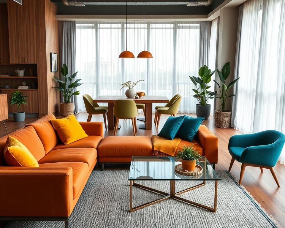
Bold contrast: jewel tones and moody accents
Jewel tone decor centers on emerald, sapphire, amethyst, and deep ruby for a luxe statement. Moody accents such as charcoal and inky blue add depth.
Place jewel tones on an accent wall, a statement sofa, or a painted kitchen island to keep impact controlled. Balance rich color with neutral backdrops so rooms feel bold without heavy.
Choose matte or satin finishes and pair with antique brass or polished chrome hardware. Boutique hotels and upscale restaurants use this mix to convey drama and refinement.
Soft pastels and modern minimalism
Pastel modern minimalism uses blush, powder blue, muted lavender, and pale peach as subtle color notes. These tones keep spaces airy while adding warmth.
Apply pastels in Scandinavian-inspired rooms, children’s spaces, or open-plan living where light must remain central. Combine pastel pieces with black metal or structural elements for a contemporary edge.
Materials such as matte lacquers, ceramic tiles, and soft textiles retain pastel hues without appearing juvenile.
Accent color strategies and color-blocking tips
Start with a dominant neutral base. Add one or two accent colors and repeat them in cushions, art, and accessories to build rhythm.
- Use color-blocking interiors to define zones: geometric wall panels, rugs, or furniture placement work well.
- Keep accents proportionally smaller than base surfaces so balance stays intact.
- Test pairings with swatches and full-size paint patches before committing.
Successful combos include sage with terracotta accents, warm greige with deep navy, and blush with matte black fixtures. Digital tools like Sherwin-Williams’ ColorSnap and Benjamin Moore’s Personal Color Viewer help visualize choices under different lighting.
Remember to consider warm versus cool bulbs and natural light direction. Matte finishes soften saturation while gloss increases perceived intensity, so pick finishes that suit each scheme.
Practical steps to adopt modern color trends in your home
Begin with a careful site survey to plan how to adopt color trends. Note natural light, fixed finishes like hardwood floors and countertops, and room function. Build a mood board using images from Architectural Digest, Pinterest, and product pages from Farrow & Ball or Benjamin Moore to visualize applying modern palettes.
Prioritize rooms that give the biggest impact: entryways, living rooms, kitchens, and primary bedrooms. Use a paint sampling guide: apply large swatches on multiple walls and view them at different times of day and under warm and cool LED bulbs. Request fabric swatches from West Elm or Crate & Barrel and test hardware finishes to see how interior color implementation holds up across materials.
Start with removable options to experiment without long-term commitment. Try peel-and-stick wallpaper, slipcovers, and interchangeable art while you refine the palette. For execution, pick finishes thoughtfully—matte or eggshell for walls, satin or semi-gloss for trim, and high-gloss for accent cabinets. Match metals to the scheme: antique brass pairs well with warm neutrals and jewel tones, while matte black or brushed nickel complements pastels and cool palettes.
Layer color through textiles, rugs, pillows, and small decor items to create continuity. Balance patterned pieces with solid furniture and repeat accent hues in lighting and ceramics. Budget for quality low- or zero-VOC paints from Sherwin-Williams or Benjamin Moore’s Natura line, and consider hiring pros for color-critical jobs. Keep a swatch book, photograph rooms under consistent light, and update home color gradually—start with a door, island, or powder room before committing to whole-house palettes. These steps make interior color implementation both trend-forward and personally lasting.