Texture in interior design is one of the simplest ways to change how a room feels and looks. It covers both tactile qualities you can touch and visual surfaces that only appear textured. Think of materials such as wood, stone, metal and fabrics, plus finishes like matte, satin and gloss, and architectural elements like panelling or exposed brick.
Understanding texture helps explain depth in interiors. Light and shadow play across uneven surfaces, creating highlights and contrast. These cues tell the eye which surfaces sit forward and which recede. By layering texture, you can push a wall back, draw furniture forward or make a small room feel more spacious.
This opening is for homeowners and design lovers across the United Kingdom who want practical inspiration. Using texture alongside colour, light and scale makes rooms more inviting and comfortable. Brands and bodies such as Farrow & Ball, Neptune, John Lewis and RIBA offer tried-and-tested approaches to finishes, textiles and surface treatments that work in real homes.
In the sections that follow, you will learn how tactile design UK techniques and thoughtful layering texture can enrich interiors and give your home a stronger sense of depth and personality.
How does texture add depth to interior spaces?
Texture shapes how we feel and see a room. It can make surfaces seem nearer or more distant, warm a cool space, and steer attention towards key architectural features. Understanding texture in practice helps designers in the UK and beyond craft richer, more layered interiors.
Defining texture in interior design
Defining texture interior design starts with two clear categories: tactile surfaces you can touch and visual surfaces that merely suggest variation. Tactile examples include woven linen, rough stone and smooth metal. Visual texture appears in printed fabrics, trompe-l’œil finishes and patterned paint.
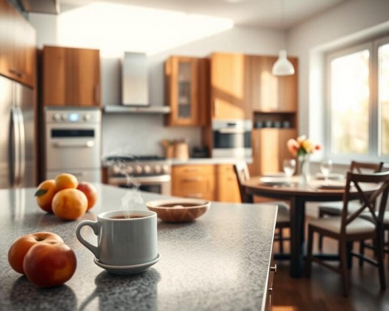
Materials bring their own language: oak, marble and wool read as natural; ceramic, glass and stainless steel feel manufactured; laminates and engineered stone sit between both. UK suppliers use terms such as grain, nap, weave, honed, flamed, brushed and embossed to describe these qualities.
Perception of depth: tactile and visual cues
The brain uses visual cues to judge depth. Contrast, occlusion, texture gradient and relative size all help. Rough surfaces create micro-shadows that raise apparent relief. Fine textures scaled across a wall can visually recede.
Tactile expectation alters perceived distance. Fabrics like velvet and boucle invite touch and feel intimate. Polished chrome and glass feel colder and more distant. A limewash or Venetian plaster wall looks closer than a smooth painted surface. A coarse jute rug anchors seating and grounds a plan.
How light interacts with texture to create dimensionality
Light and texture work together to build form. Incident angle and intensity change how relief reads. Low-angle light increases shadows and highlights, heightening three-dimensionality. Diffuse overhead light softens features and reduces apparent depth.
Light matters in the UK where orientation makes a difference. North-facing rooms get cooler, indirect light that benefits stronger texture or warmer materials. South-facing spaces receive brighter sunlight that enhances subtle surfaces. Finish behaviour matters too: matte finishes absorb light and emphasise irregularities, while gloss reflects light and can flatten perceived depth.
Psychological and emotional effects of textured spaces
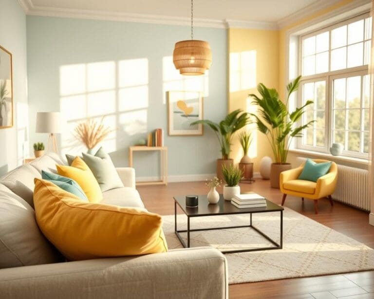
Texture shapes mood and sensory response. Soft, plush surfaces create calm and comfort suited to bedrooms and living rooms. Rugged, tactile materials lend drama and authenticity in kitchens or feature walls. Smooth, high-gloss surfaces read as modern and minimal.
Research in environmental psychology links tactile richness to warmth and well-being. Sparse, flat interiors may feel sterile. Practical choices follow: plush, insulating materials work well for restful bedrooms. High-traffic hallways need durable textures such as porcelain tile or hardwearing wool rugs to deliver reassuring performance.
Practical ways to layer texture for depth and interest
Layering texture interiors starts with a clear plan and a dominant surface to anchor the room. Begin with one main material for floors or large furniture, then introduce contrasts and accents to build visual and tactile richness. The aim is to create spaces that feel lived-in, warm and considered.
Combining materials: wood, metal, stone and textiles
Pair warm woods such as oak or walnut with cool metals like brass or brushed chrome to create contrast and balance. Place rough stone beside smooth timber to give a room tactile complexity that invites touch.
Start with a dominant material, for example oak flooring or a walnut sofa, then add secondary elements in fixtures and accessories. Natural materials such as marble worktops or oak floors act as timeless textural anchors. For sourcing, look at John Lewis & Partners for textiles and Barker and Stonehouse for timber furniture when planning purchases in the UK.
Mixing surface finishes: matte, satin and gloss
Matte, satin and gloss finishes each shape depth in distinct ways. Matte absorbs light and shows surface detail. Satin gives a gentle sheen that is practical on cabinetry. Gloss reflects light and creates focal points.
Use a matte base on broad areas like plaster or matt paint to reveal texture. Choose satin for mid-level elements such as cupboards where durability meets subtle sheen. Reserve gloss for accents like splashbacks and trims to add sparkle without overwhelming the scheme.
A simple layering rule works well: a matte base, satin mid-level and gloss accents. This keeps rooms balanced and allows highlights to read as intentional.
Using soft furnishings to add tactile layers (rugs, cushions, throws)
Soft furnishings texture is the easiest way to change a room’s feel without structural work. Mix pile heights—shaggy rugs with flatweave runners—and combine bouclé, linen and velvet to create depth.
Style in odd numbers of cushions, vary sizes and textures, and layer rugs to define zones in open-plan living. For family homes choose washable or stain-resistant fabrics. Designers Guild and Romo offer performance blends that suit busy UK households.
Incorporating architectural texture: panelling, mouldings and exposed finishes
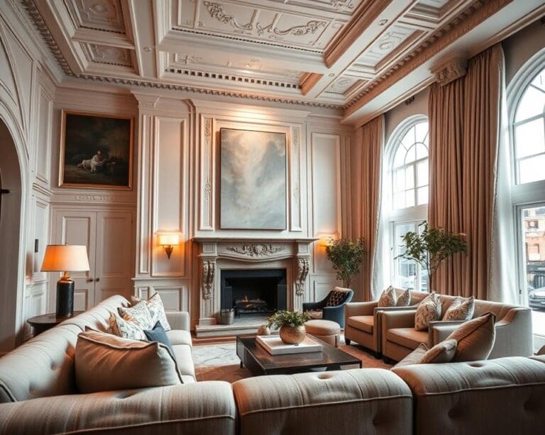
Architectural texture panelling UK options range from raised panelling to tongue-and-groove that cast fine shadow lines. Plaster mouldings introduce classical relief. Exposed brick, beamwork or concrete give honest, characterful surfaces.
Paint panelling in a slightly different sheen or tone to emphasise relief. Consider lime plaster or Venetian techniques applied by skilled craftsmen for tactile interest. Check conservation rules on listed properties and remember acoustic and insulation needs when exposing or adding surfaces.
Styling tips and common pitfalls when using texture
Good texture work lifts a room from flat to inviting. Start with clear intent and a simple plan. Think about how surfaces will feel and read at a glance. That helps when you explore styling texture interiors across different rooms.
Balancing texture with colour and pattern
Texture can calm or amplify colour. Deep reliefs and nubby weaves soften bold hues. Smooth, reflective surfaces will sharpen a colour’s intensity. Use texture and colour balance as a tool: if fabrics or wallpapers carry strong patterns, pick subtler textures nearby.
As a rule, let one element dominate. If pattern is the hero, opt for understated textures. If texture is the focus, keep the colour story simple. Designers at Farrow & Ball often recommend tonal restraint so texture can do the emotive work.
Scale and proportion: choosing textures that suit room size
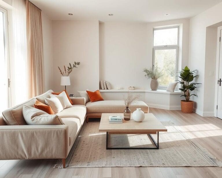
Match texture scale to the space. Large-scale textures, such as oversized stone tiles or a chunky wool rug, suit open-plan living. Fine-grain textures like small mosaics or lightweight linens keep compact rooms feeling airy.
Use texture scale proportion to change perception. Horizontal panelling or long-grain timber can widen a narrow room. A textured feature wall can shorten an overly long space without cluttering it.
For a small London flat, choose delicate textures and layered textiles for warmth without visual compression. In a country cottage, embrace rustic, larger textures to support patterned upholstery.
Maintaining cohesion: choosing a unifying material or tone
Tie varied surfaces together with a cohesive texture palette. Pick a recurring material, such as oak joinery or brass fittings, or commit to a consistent tonal range like warm neutrals or cool greys.
Limit the core palette to three or four tones. Repeat textured elements in different rooms to build rhythm. This approach makes diverse finishes feel intentional rather than accidental.
Practical considerations: maintenance, durability and accessibility
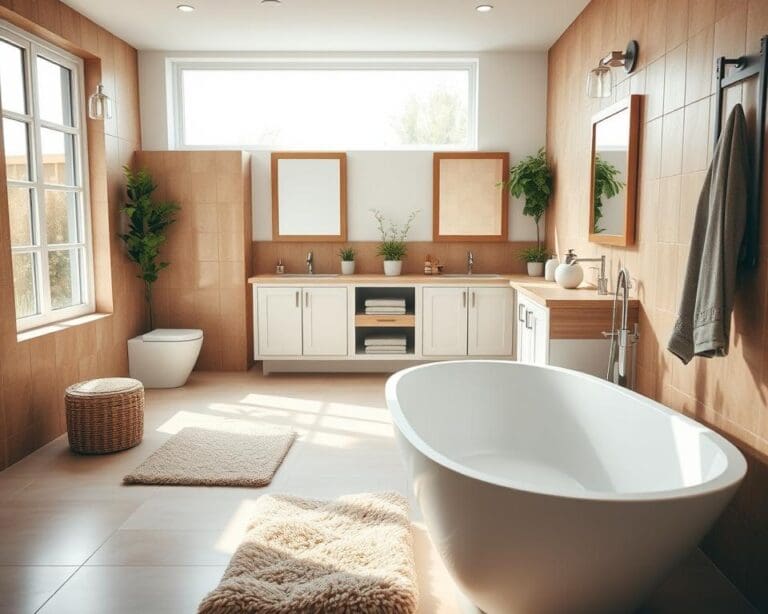
Think about use. High-traffic zones need hardwearing, cleanable finishes such as porcelain tile, treated timber or performance fabrics like Sunbrella and Crypton. Reserve delicate textures like silk and raw linen for low-use areas.
Check durability against UV fade, abrasion and pets. For safety, avoid very rough floor finishes that could snag or cause discomfort. Consider sensory needs: some people prefer smoother surfaces, while tactile contrast can aid navigation for visually impaired occupants.
When planning upkeep, factor in maintenance textured surfaces UK standards for cleaning and longevity. Choose finishes that meet life in a busy British household.
Inspiration and real-world examples to spark ideas
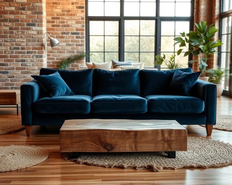
Explore texture inspiration interior design through practical UK examples that show how layered surfaces shape mood. In an urban townhouse living room, oak herringbone flooring, low-sheen plaster walls, a deep-pile wool rug, velvet cushions and a stone fireplace surround combine to create warmth. The hard grain of oak and the soft pile of wool sit against matt plaster to build visual and tactile depth.
A contemporary new-build kitchen offers another lesson in textured interior examples UK. Matt lacquer cabinetry, satin brass handles, a honed granite worktop and a terrazzo splashback with subtle aggregate demonstrate how matte and satin finishes interact. This mix keeps the clean lines intact while adding sophistication and understated interest.
Look to cottage-style bedrooms for cosy texture case studies. Tongue-and-groove panelling in a warm neutral, linen bedding, a boucle throw and reclaimed timber beams layer history and softness. Choosing one strong architectural texture, such as panelling or exposed beams, then adding complementary textiles yields a room that feels both lived-in and considered.
Small flat solutions show how real-world textured rooms can maximise perceived space. Light-reflecting gloss on compact kitchen units opens sightlines, textured wallpaper behind shelving creates a focal plane, and layered rugs define zones without clutter. For further texture inspiration interior design in the UK, consult Grand Designs, Ideal Home, Homes & Gardens, visit showrooms such as Made.com, Heal’s and Dwell, or explore material libraries at the Surface Design Show. Start by sourcing swatches, testing textures in your room light, and trying one change—a rug, matt plaster or panelling—to feel how texture adds depth and personality.