Neutral tones interior styling endures because it answers both aesthetic taste and practical need. From Georgian townhouses to contemporary London flats and rural cottages, timeless neutrals adapt to varied British light and architecture while creating calm, elegant neutral interiors that feel both current and rooted in history.
This article will explain why neutral colour schemes UK remain a favourite among homeowners and designers. We draw on sources such as the Victoria and Albert Museum’s historic interiors, guidance from the Royal Institute of British Architects, and contemporary reporting in House & Garden and Architectural Digest UK. Paint houses like Farrow & Ball and Little Greene help trace how palette choices evolve yet stay restrained.
Readers can expect clear answers: we will define neutral shades precisely, trace historical roots, outline the design principles that keep them relevant, and highlight the practical benefits for resale, upkeep and seasonal updates. Practical, inspirational guidance tailored for UK homes follows, showing how to use timeless neutrals with confidence.
Why are neutral tones timeless in interior styling?
Neutral schemes offer a calm foundation that feels deliberate rather than dated. In British homes, a well-chosen neutral can read as modern, classic or cosy depending on finishes, light and furnishings. The following short notes explain what counts as a neutral, how history shaped their use and why they make rooms feel calm and refined.
Defining neutral tones and the palette range
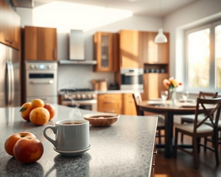
Neutrals are low‑saturation colours close to greys, beiges, whites and blacks. Think greiges, warm off‑whites, stone, taupe and soft clay. Common practical examples include eggshell, chalk, dove grey, putty, mushroom, sand and charcoal.
Undertones matter. A neutral with a pink or green cast will pair differently to one with a warm yellow or cool blue base. Brands such as Farrow & Ball and Little Greene publish undertone charts that help with selection. Test paint samples in daylight and under lamps to spot subtle shifts in UK light conditions.
Historical roots of neutral use in interiors
Neutral finishes appear across history. Early classical interiors and English country houses used stone, limewash and natural textiles as restrained backdrops. These materials set a simple stage for furniture and craft.
Victorian rooms briefly favoured richer palettes, yet the Arts and Crafts movement and later modernism returned to pared‑back colours. Scandinavian designers such as Alvar Aalto and Arne Jacobsen promoted minimalist neutrals that emphasised form and function.
Designers and British brands including Heal’s and Tom Dixon champion refined neutral schemes today. The history of neutral colours maps a cycle between ornament and restraint, with neutral palettes recurring as homes seek calm and utility.
How neutral hues convey calm and sophistication
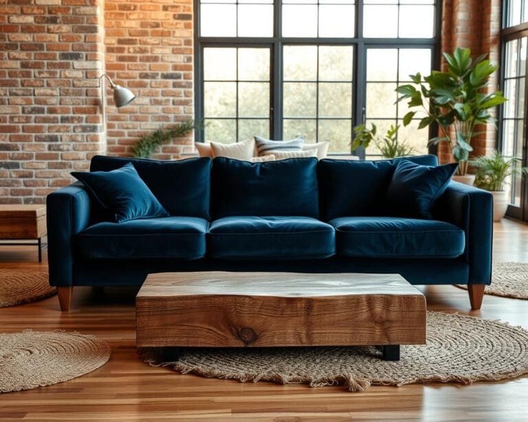
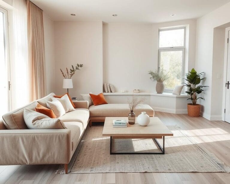
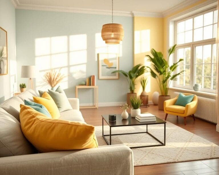
Neutral tones reduce visual noise. A muted backdrop creates restful spaces that support wellbeing, particularly in busy urban flats and terraced houses across the UK. Rooms feel less cluttered when colours do not compete for attention.
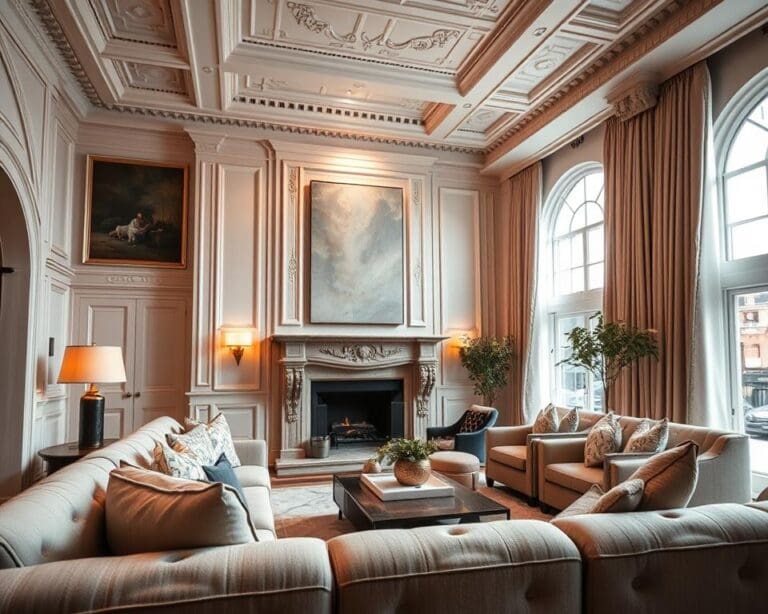
Restraint reads as refinement. Neutrals let architectural detail, fine joinery and quality materials take centre stage. This approach signals considered taste over fleeting trends.
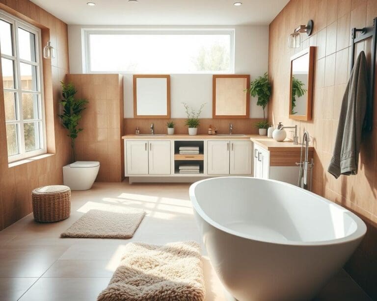
Neutrals also affect light and space. Pale, cool or warm neutrals reflect and diffuse light, making smaller rooms appear brighter and larger. They harmonise with timber, stone and wool for an elevated, enduring interior.
Design principles behind the enduring appeal of neutral palettes
Neutral schemes endure because they rest on clear, flexible rules that suit many homes and tastes. These principles guide choices in material, light and composition so spaces feel calm and intentional. Good neutral design principles let traditional and modern elements sit comfortably together.
Versatility across periods and materials
Neutral interiors versatility shows in Georgian townhouses, mid-century flats, rustic cottages and new builds. A warm beige works with Victorian joinery, while cool greys suit minimalist furniture in contemporary developments. Sandy tones feel right in coastal or rural settings.
Neutral palettes pair well with painted timber, exposed brick, stone fireplaces, plasterwork, natural fibres and metals such as brass or chrome. This compatibility makes it simple to mix antiques, modern pieces and bespoke joinery without clashing.
Creating balance with texture, light and contrast
Texture becomes the main way to add interest in a neutral scheme. Woven rugs, boucle upholstery, linen curtains and fluted glass give depth. Contrast appears through matte versus gloss finishes and the play between soft textiles and hard surfaces.
UK light can be changeable. Use mirrors, gloss trims and light-reflecting neutrals to lift dull rooms. Warm neutrals help north-facing spaces feel cosier by bouncing warm tones around the room.
Design practices from leading designers recommend layering textures with neutrals to build character without colour. Tonal contrast from light to dark neutrals keeps a scheme dynamic while staying restrained.
Neutral colours as a backdrop for art and accessories
A neutral backdrop for art lets paintings and sculpture take centre stage. Muted walls and furnishings stop competing with bold pieces, making galleries and homes alike feel curated.
Curate accessories with restraint. Use accent colours in a few cushions, a ceramic or a single painted feature to create focal points. Gallery-style walls on muted backgrounds or sculptural lighting by designers such as Tom Dixon stand out more when the surroundings are understated.
Layering neutrals and careful textures with neutrals maintains harmony while giving each object room to breathe.
Practical benefits for homeowners and designers
Neutral schemes offer practical advantages for owners and designers in the UK housing market. They simplify decisions during renovations and create a calm backdrop that suits many tastes. Estate agents such as Savills, Knight Frank and Foxtons routinely advise neutral staging to speed up viewings and strengthen neutral home resale value.
Timeless resale value and marketability
Neutral palettes broaden buyer appeal by reducing perceived renovation needs. A buyer can more easily imagine their furniture and style in a neutral space, which helps marketable interiors and can lead to quicker sales. Savills and Knight Frank note that neutral decor is effective for attracting diverse groups, from young professionals to downsizers.
Landlords and homeowners gain a strategic edge when preparing a property for sale. Neutral rooms lower the emotional barriers for viewings, making properties appear move-in ready and often supporting stronger valuations across UK markets.
Ease of updating with seasonal accents
Neutrals give a flexible foundation that lets you refresh a room without major cost. Swapping textiles, lampshades, rugs or artwork can shift mood between seasons. You can update neutral interiors quickly by changing soft furnishings or painting a single feature wall.
Keeping core pieces neutral—sofas and fitted joinery—encourages sustainable choices. Reupholstering or patching rather than replacing reduces waste and saves money over time.
Maintenance, durability and visual longevity
Mid-tones and patterned neutrals hide light wear better than extreme pale or dark surfaces. Choose durable neutral finishes like washable matt emulsions and scubbable paints for kitchens and halls. Opt for stain-resistant fabrics such as performance linens or Crypton textiles in family homes.
For high-traffic areas select darker or patterned neutrals in hallways, treated upholstery in living rooms and washable paints in utility spaces. Good choices for maintenance neutral colours prolong visual appeal and cut down on frequent redecorations.
Neutral palettes age with grace, making rooms less likely to date quickly. This visual longevity reduces the need for full refits and keeps spaces marketable interiors for longer.
How to use neutrals creatively in modern UK interiors
Start by planning in layers: a base of walls and floors, a mid-layer of sofas and rugs, then accessories and a few highlight pieces. Pick a principal neutral family—warm, cool or earthy—and add two to four complementary neutrals to avoid a flat result. For practical testing, order large paint samples and fabric swatches and view them in natural and evening light to see how typical UK weather shifts colour.
Mix materials and finishes to bring depth to neutral schemes. Combine British oak, honed stone and wool with brass or blackened steel and glass. Use tactile contrasts such as smooth plaster beside knobbly knit and raw timber; these neutral styling tips keep a palette tactile and modern without adding visual clutter.
Add one or two restrained accent colours—deep green, navy, terracotta or muted ochre—in measured doses. A velvet armchair, a painted doorway or a statement rug can become a focal point against neutral backgrounds. Consider sculptural furniture or a bold pendant light as a single statement piece to lift the scheme while preserving calm.
Think room-by-room for British interior ideas: warm greige in north-facing living rooms with layered rugs for cosiness; shaker-style kitchen cabinets in soft grey or sage with honed stone worktops and brass fixtures; bedrooms in off-white or muted clay with quality linens and blackout curtains; bathrooms with stone-effect tiles and oak shelving. Source sustainable options from brands such as Farrow & Ball or Little Greene, and favour British wool, linen and reclaimed timber to keep creative neutral interiors UK beautiful and responsible.